National Parkinson Foundation
_
Client Category
Foundation
Project Type
Brand Development

Designing a unifying identity for a national health organization.
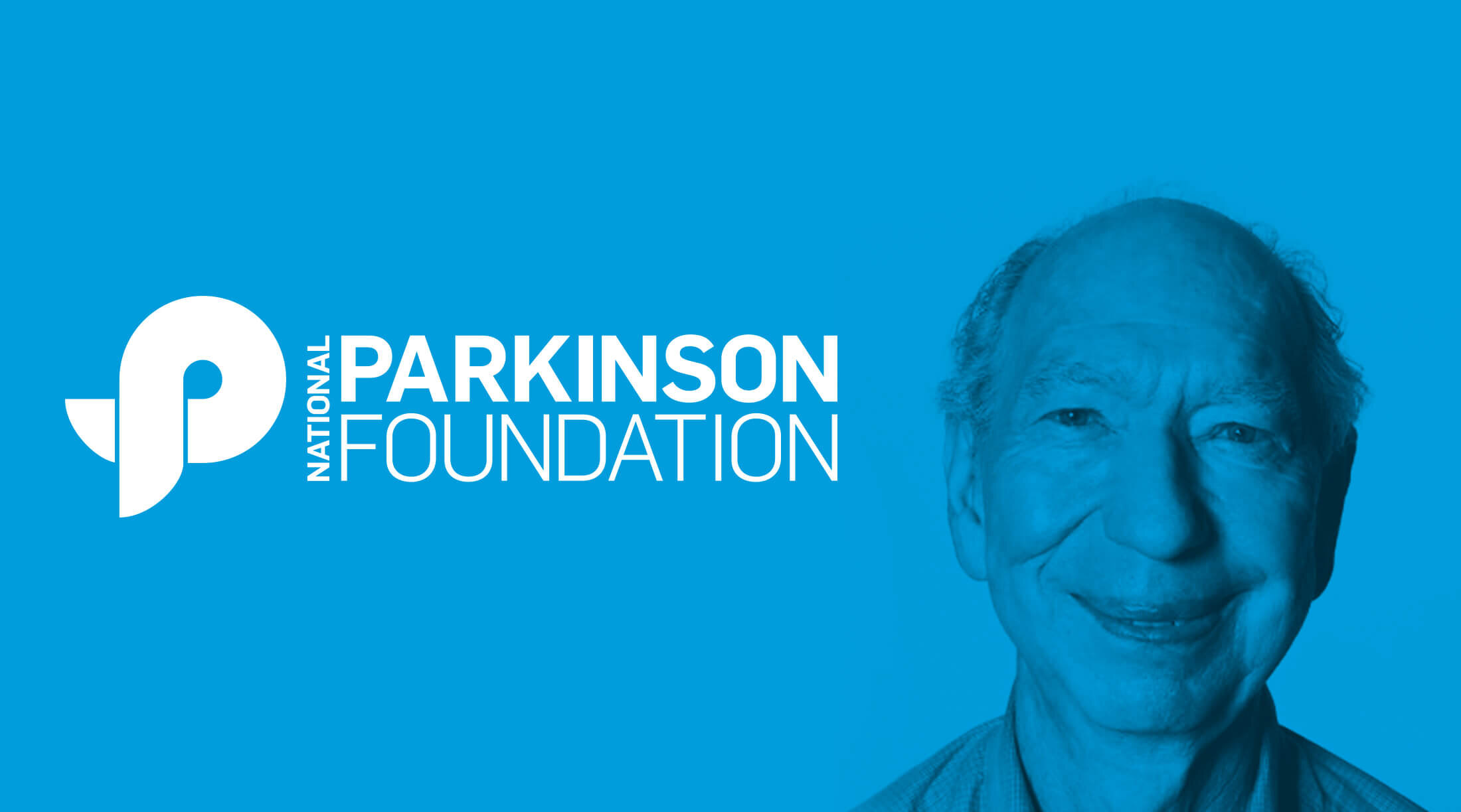
The National Parkinson Foundation sought a brand identity that was easily understood, recognizable and adaptable across a wide range of applications. We developed a distinctive "P" logo, inspired by the iconic awareness ribbon, to represent both the organization and the disease.


A significant aspect of the branding system involved establishing structures and guidelines for affiliates and sub-brand logos, ensuring consistency and cohesion across various platforms. Following the organization's merger with the Parkinson's Disease Foundation to form the Parkinson’s Foundation, the "P" was evolved and simplified to align with the new direction, maintaining its core symbolism while adapting to the unified brand.